The World Bank’s income groups are widely used in global data. This article explains how they are defined and updated.
When people talk about countries as “rich” or “poor”, they can mean many different things. But for researchers and policymakers, it helps to have a way to compare countries by income using clear criteria.
One widely used approach is the World Bank’s income classification system, which places countries into four groups: low, lower-middle, upper-middle, and high-income countries. These groups are primarily intended for analytical and statistical purposes.1
These income groups are used across many international datasets, like the World Bank’s World Development Indicators — which include information on topics from access to energy and education to global trade — and are often cited in research and the media.
This article explains how countries are assigned to income groups, how the thresholds between groups are set and updated, some of the limitations of this classification, and how we use these groups at Our World in Data.
Every year, the World Bank assigns each country to an income group based on its gross national income (GNI) per capita. GNI per capita is a measure of the average income of a country’s residents, including income that is earned abroad.2 It’s calculated by dividing a country’s total GNI by its population.
The World Bank uses GNI per capita because it’s available for most countries. It’s not a perfect measure of development, but it usually lines up with other indicators of living standards, like child mortality, life expectancyand access to basics such as safe drinking water.3
Since countries report GNI in their local currencies, the World Bank converts these figures into US dollars using exchange rates. The conversion uses the Atlas Methodwhich averages exchange rates over the current and past two years, adjusted for inflation, to reduce short-term currency fluctuations.
We might expect the World Bank to adjust for what people can actually buy with their income — that is, to adjust for differences in purchasing power between countries — but this isn’t part of the current method. We come back to this in the limitations section below.
Once GNI per capita is expressed in US dollars, countries are put into one of four income groups based on specific thresholds. The classification covers most of the world: 189 World Bank member countries and many others with populations over 30,000.
Every year in July, the World Bank updates the classification using the most recent GNI per capita estimates.4
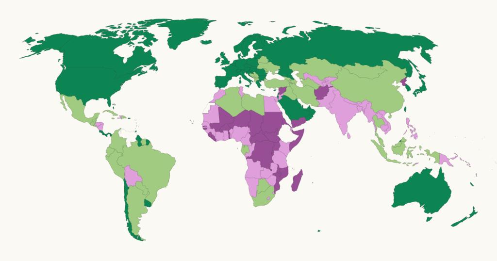
The map below shows how countries are classified by income. Using the timeline, you can explore how the groups have changed annually since 1987.

The income thresholds that separate groups were first set in the late 1980s when this classification system was introduced. At that time, these were aligned with the World Bank’s policies for lending money to countries. The Bank used average incomes to determine which countries were eligible for concessional loans (loans with low interest rates and long repayment periods), which were reserved for the world’s poorest countries.
This threshold for receiving such loans became the boundary between low-income and middle-income countries. The Bank then added two more thresholds to allow for further distinctions among the remaining countries. These were chosen based on the distribution of country incomes at the time, rather than on lending rules.
Today, the thresholds are no longer linked to the Bank’s operations, but they have been updated yearly to account for inflation. This adjustment is based on a measure of global inflation.5
This means that the classification is absolute. Countries are put into groups according to predetermined thresholds, and a country’s placement depends only on its GNI per capita, not on how it stacks up relative to other countries.
The thresholds for the 2024 income groups were (in US dollars):6
- Low income: $1,135 or less
- Lower-middle income: $1,136 to $4,495
- Upper-middle income: $4,496 to $13,935
- High income: More than $13,935
If a country’s GNI per capita crosses a threshold, it moves into a new income group in the following update.
Because GNI per capita changes over time, and thresholds are revised annually, countries can move between income groups over time. These movements may reflect real changes in income, shifts in exchange rates, or updates to population data.
In the long run, most countries have moved up the income ladder as their economies have grown. However, countries can also move down — and some have, particularly in periods of war and economic crisis. Two examples are Syria and Yemen, which went from low-middle income to low income in 2017. The number of countries in each income group has changed considerably since 1987.
When we hear that there are four income groups, we might imagine that the world’s population is evenly divided across them, with around 25% of people living in each. But this isn’t the case. Again, these groups are defined based on absolute thresholds, not relative cut-offs that change based on other countries’ progress.
In 1987, more than half of the population lived in low-income countries. Today, that share has fallen to less than 10%. Only a small share of the world’s population lives in low-income countries, while most live in middle-income countries. You can see this change over time in the chart below.

The World Bank’s income groups offer a useful way to compare countries by income level, but like any classification system, they have limitations.
One limitation is that the placement into a group is based only on GNI per capita, which reflects the average income in a country. As an average, it doesn’t show how income is distributed within the country. If income is distributed very unequally, a country classified as high-income could have large numbers of people living in poverty or high levels of income inequality. Today, many of the world’s poorest people live in countries labeled “middle-income”.
In addition, GNI per capita may underestimate average incomes in countries where much of the economy happens informally or isn’t recorded. In particular, in lower-income countries, many people work outside the formal sector. GNI figures may not fully capture what people earn and live on in such cases.7
The thresholds that separate income groups also have limitations. They were originally tied to the Bank’s lending rules in the 1980s, and since then, they have remained mostly unchanged, apart from adjustments for inflation. There are no natural breaks in income levels at these thresholds, and moving from just below to just above a threshold doesn’t mean people’s living standards have changed meaningfully. Some researchers have questioned whether the current thresholds capture meaningful differences in development and have called for updated approaches.8
Finally, this classification relies on market exchange rates to convert GNI per capita from local currencies into US dollars. With the Atlas Methodthe World Bank uses rates averaged over three years to smooth fluctuations, but this approach doesn’t account for differences in purchasing power between countries — that is, what people can buy with their income in their own country.9 Using purchasing power parity (PPP) adjusted figures, such as international dollarsis one option to factor these price differences in. The World Bank has acknowledged this issue and notes that using PPPs is under consideration for future updates.
On Our World in Data, we use the World Bank’s income groups in many of our charts, for example, to compare trends across low- and high-income countries. In many charts, you will find an option to group countries by income level.
When this option is shown, we always classify countries based on their income group in the latest World Bank classification at the time of creating or updating the chart. That grouping is then applied consistently across all years. This helps readers compare how indicators have changed over time for the same fixed set of countries.
You can see how this works in the chart below. For example, the data points for low-income countries refer to the same set of countries in 2023, 2000, 1950, and even 1750. The same applies to the other groups, which were all based on how countries were classified when we last updated this chart.

Acknowledgments
Thanks to Hannah Ritchie, Pablo Rosado, Marcel Gerber, and Edouard Mathieu for their comments and feedback on this article.
Cite this work
Our articles and data visualizations rely on work from many different people and organizations. When citing this article, please also cite the underlying data sources. This article can be cited as:
Bertha Rohenkohl and Pablo Arriagada (2025) - “How does the World Bank classify countries by income?” Published online at OurWorldinData.org. Retrieved from: ' [Online Resource]BibTeX citation
@article{owid-world-bank-income-groups-explained,
    author = {Bertha Rohenkohl and Pablo Arriagada},
    title = {How does the World Bank classify countries by income?},
    journal = {Our World in Data},
    year = {2025},
    note = {
}
Reuse this work freely
All visualizations, data, and code produced by Our World in Data are completely open access under the Creative Commons BY license. You have the permission to use, distribute, and reproduce these in any medium, provided the source and authors are credited.
The data produced by third parties and made available by Our World in Data is subject to the license terms from the original third-party authors. We will always indicate the original source of the data in our documentation, so you should always check the license of any such third-party data before use and redistribution.
All of our charts can be embedded in any site.