The pivot from analog gauge needles to ubiquitous screens is a sad blow to the artistry of the automobile. But after a week in a new Porsche Taycan, I’ve come to realize that the German automaker’s digital dashboards look a lot better than pretty much everyone else’s in 2025. That’s because Porsche‘s screen clusters are unique in two critical ways.
First, unlike almost every other car company that slaps a rectangular screen in front of the steering wheel, Porsche gives its computer clusters a distinctive physical shape. Particularly in front of the driver, but also in the central area.
Second, when they’re powered up, Porsche’s modern gauge clusters are clean, legible, and good-looking without being boring or annoying. More cars than you might expect fall close to one of those suboptimal extremes.

It’s really that simple.
I’ll stop short of calling the Porsche Taycan’s gauge cluster perfect—there are a few tweaks I’d make and some different info configurations I’d like to have. But out of the countless new cars I’ve driven in the last few years, this one had the best version of a screen-based gauge setup I’ve seen.
Now that you’ve got my thesis, I’ll expound a little for those who aren’t scrolling straight to the comments to tell me how wrong I am.
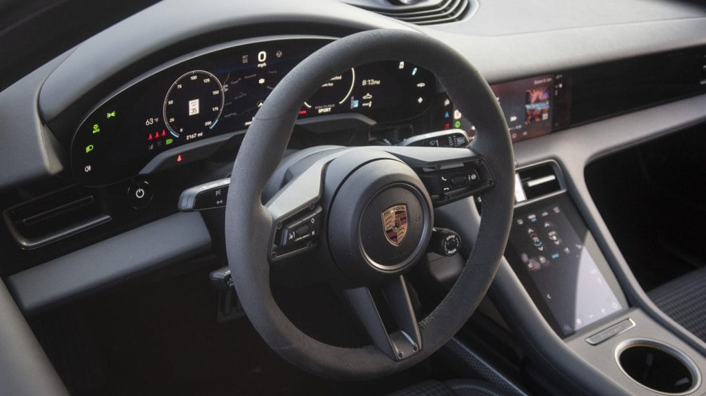
The Porsche Taycan’s gauge screen has a pleasing shape that flows thoughtfully with the rest of the cockpit. More specifically, it pretty much follows the outline of a more traditional gauge cluster bezel—it’s kind of like a wide kidney bean. Already, that makes the driver’s seat feel like a special place, as opposed to a rectangular screen that makes a car’s cockpit feel like a cubicle work station.
The infotainment display, the main screen where you run your navigation and entertainment settings, only has square edges. However, it’s tucked so perfectly into the rest of the dashboard that when it’s off (which is easy to toggle with a console control), it effectively disappears.

Exceptional interior design doesn’t have to be complicated, as the Taycan’s dashboard illustrates quite nicely. And on the screen itself, once again, less is more.
When you switch modes in a Toyota Camry, you have to sit through seven seconds of the entire gauge cluster dwelling on an image of the car and the word “SPORT.” Mini has freaking theme songs for its drive modes. And BMW, man, even something as simple as a speedometer in a modern Bimmer is bristling with 20 shades of coloring and surrounded by nonsensical decorative shapes.


The Taycan has no such nonsense. Its cluster is just an orderly, purposeful readout of critical car information in high-contrast colors. It’s classy and sporty, which fits the aesthetic Porsche’s going for just right.
I love me some whimsy, in life and in car design. But slacking off on physical cabin design to go crazy with digital display-screen decorations, which seems to be all the rage right now, is inelegant and uncool.
I won’t really be happy until I see cars get back to driver displays with actual depth and motion. But my time with the electric Porsche has at least given me some hope that screen-based interfaces can be done in a way that feels intentional, deliberate, and engaging without being corny or distracting.
Is there another current-era gauge cluster you like better? You can reach the author at [email protected].