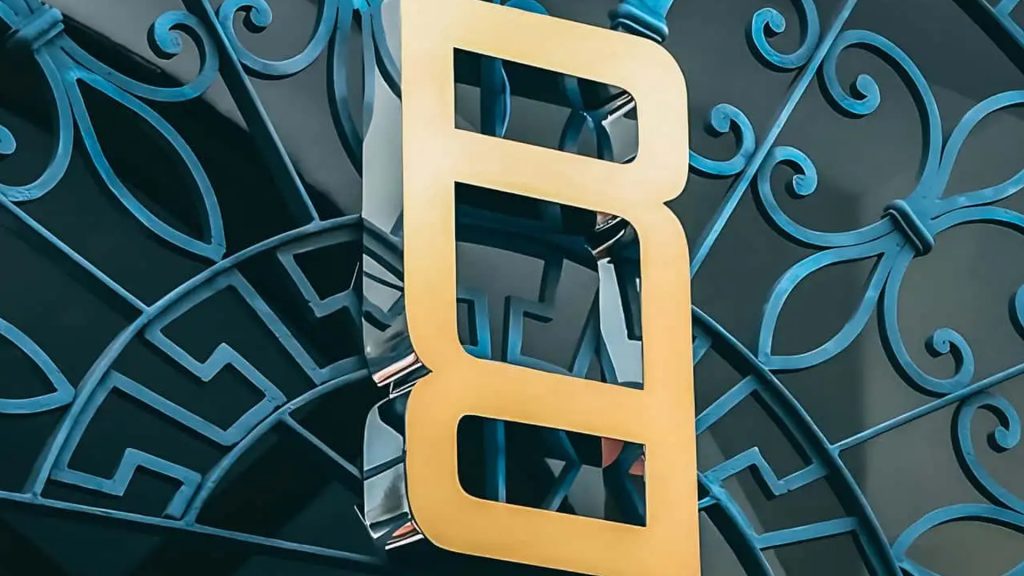
Range Rover reportedly revealed a new logo at a recent investor meeting. Well, two logos really: A little one with an R stacked on top of an inverted R, and a repeating R pattern that looks like it was cribbed from a Coach or Gucci bag design.
Autocar posted that these new emblems are not replacing the spelled-out R-A-N-G-E-R-O-V-E-R emblems that appear on the front and rear of the vehicles, but will just be used in places where such a long piece of horizontal text doesn’t fit. It shared a floating, 3D version of the symbol from JLR that reminds me of old WordArt fonts a little bit. The British publication quoted a brand spokesperson saying:
“The Range Rover Motif has been developed as a smaller symbol for where our familiar Range Rover device mark does not fit, such as on a label or as part of a repeating pattern, and within event spaces where an emblem is more appropriate.”


I was initially deeply underwhelmed by this symbol, and I see I’m not the only one—my buddy Chris Perkins over at Engine‘s assessment is “goofy as hell.” But in the context of simply something to use where the brand wants a vertical banner instead of a horizontal one, whatever, it’s fine.
It’s kind of the only thing Range Rover could do with two Rs, anyway. Two offset-stacked Rs is Rolls-Royce, one backwards R followed by another R would be too rowdy, so what’s left? Put one upside-down!
The repeating R pattern looks pretty low-effort as it’s digitally rendered, but I’m going to remain optimistic that it will be cooler when it’s deployed as a seat pattern, texture, or on an accessory. We sent a note to our contact at JLR, too, and will update this post if we get any more insight on how and where exactly this new symbol will be used.
JLR’s been trying to separate its models out into distinctive brands for some time now, with Range Rover being the luxury branch, Discovery being the entry-level option, and of course, Defender carrying the torch of off-road capability. But the Land Rover brand itself is not going anywhere in the immediate future. As Autocar quoted CEO Adrian Mardell from a previous presentation:
“Among its many attributes, Land Rover is rightly synonymous with off-road credentials, with technology capabilities, with significant and huge safety features. It is still integral to our business. It will remain visible on our vehicles. It will remain on our websites, in social media and at our retail sites.”
I love Land Rover’s green oval logo. It’s cute and instantly recognizable without looking like it’s trying too hard. As opposed to, say, the new Subaru Wilderness emblem, which is way too loud and pandery.
The people running Land Rover and Range Rover have been working hard to scrub out the whimsy that made the brand appealing through the 2010s, in spite of the vehicles’ exorbitant running costs and a ghastly reliability reputation. Range Rovers have, generally, gotten better at avoiding tow trucks over the last decade, but they’ve also become far less distinctive and interesting-looking.


My colleague Jerry Perez thinks I’m nuts, and we argue about this every time it comes up—but look at a Range Rover from around 2005 and one from today. The old one looks like a regal adventure rig, with wacky lights and truck lines. The new one looks like it belongs on a shelf at Best Buy.
All that to say—I’m not surprised that a sleek and soulless stack of letters is the direction the brand wanted to go for its latest iconography. Better this than Paddington Bear waving a Union Jack while jumping in a mud puddle, but I’m looking forward to the day when the trend of sans-serif everything gives way to a little more color and creativity.
Got a tip? An opinion on Range Rover’s new logo? Drop the author a note at [email protected].


